You’re driving through town when you realize you’ve just passed some of the world’s most well-known companies or find yourself grabbing for your phone to order when you don’t feel like cooking.
We’re going to look at the most popular food brands today. Looking through this list can either provide you with fast food logo inspiration or turn you into an expert who can name fast food logos without knowing their names!
McDonald’s by Ray Kroc
It’s impossible to discuss the most well-known restaurant logos without including the iconic golden arches. There are currently around 34,480 McDonald’s locations in 119 countries. McDonald’s logo has a fascinating backstory, dating from its creation to its current status as a significant competitor.
Then, in 1962, McDonald’s began looking for a new design to stay up with the times and replace its former design, which was considered outdated. That’s when they decided to turn the arch into an “M,” which can now be seen worldwide.
KFC by Tesser
![]()

Colonel was once shown as a businessman in previous versions of the Kentucky Fried Chicken logo, which did not have the same inviting sense as the current version. By adding color and utilizing the acronym KFC instead of the word “fried,” the logo was changed to give Colonel Harland Sanders, the company’s creator, a friendlier appearance. It’s more vibrant, has a more prominent black bow tie, and, of course, the beard and glasses!
Mister Cooper by Johnson Banks
Mister Cooper is an ice cream store for adults that serves alcoholic ice cream in various flavors. Why is this logo so well-known? It cleverly incorporated the brand’s name into a creative font and used negative space to spell out “ice cream.” In a nutshell, you identify this emblem because of its distinctive shape. The character of the brand is portrayed in this logo.
Domino’s Pizza by Tom Monaghan
The Domino’s Pizza concept is an example of incorporating history into your logo. Apart from the delicious pizza, Tom Monaghan, the owner, added the three dots to the logo to represent the original Domino’s restaurants from 1965. On the other hand, the name was suggested by a former employee who had a change of heart and returned to work for Tom.
Starbucks by Terry Heckler
![]()

The world’s most famous cafe’s logo is simple. It was one of the first large brands to employ the modern design that has been increasingly popular among restaurants and businesses in recent years.
The history of the Starbucks logo is fascinating; they first started looking for a design in 1971, and they wanted to capture the maritime traditions of early coffee dealers. They looked through many old publications on the subject of marine exploration. They came across a sixteenth-century Norse woodcut of a two-tailed mermaid with the company’s original name, Starbucks Coffee, Tea, and Spice, circled by the company’s actual name. The intriguing woman is known as “The Siren” has always been a part of their logo though they underwent years of remodeling. The phrase “The Siren” has become synonymous with Starbucks.
Taco Bell by Lippincott
Taco Bell redesigned its logo in 1996, using a sans-serif typeface and changing the colors from vibrant to entirely purple. The new logo was created by Lippincott and Taco Bell’s internal design team to coincide with their flagship store in Las Vegas.
Jollibee by Manuel Lumba
The bee mascot and logo, which Mickey Mouse and Ronald McDonald inspire, represent Filipinos who are hardworking, joyful and don’t crumble under pressure.
Pizza Hut by Lippincott and Sam Moyers
We can’t discuss well-known companies without mentioning the chain known for its red roof. Pizza Hut is one of the most renowned restaurants globally, with its logo visible all over the globe.
Their first logo was created in 1955 and included their mascot, Pete, holding the words “Pizza” and “Hut.”
Pizza Hut didn’t start utilizing a more basic logo with its distinctive red roof style until 1968. Pizza Hut then went through a series of design revisions before settling on the current design, which they started utilizing in 2014.
SubWay
It’s no wonder that the restaurant with the most locations throughout the world also has one of the most well-known logos in the restaurant industry. SubWay has gained popularity thanks to its commitment to providing clients with fresh cuisine in a timely and convenient manner.
Sbarro by Dushan Wijesekara
The primary colors of the Italian flag are included in this Italian restaurant chain, which appeals to individuals who seek Italian cuisine. Sbarro’s new logo is modern, with a visible pizza symbol, and it’s a unique spin on traditional Italian restaurant design.
Dunkin Donut by Lucia DeRespinis
The company most known for providing people with their daily cup of coffee has long been a part of American culture. Their logo makes sure that everyone knows it by putting “America Runs on Dunkin” across the bottom of the image and a cup of coffee that promotes their brand as the ideal way to start the day.
But the logo has not always looked like that; in fact, it has undergone several significant changes throughout the years to arrive at its current state. There was also a mascot named Dunkie, who was employed in the 1950s.
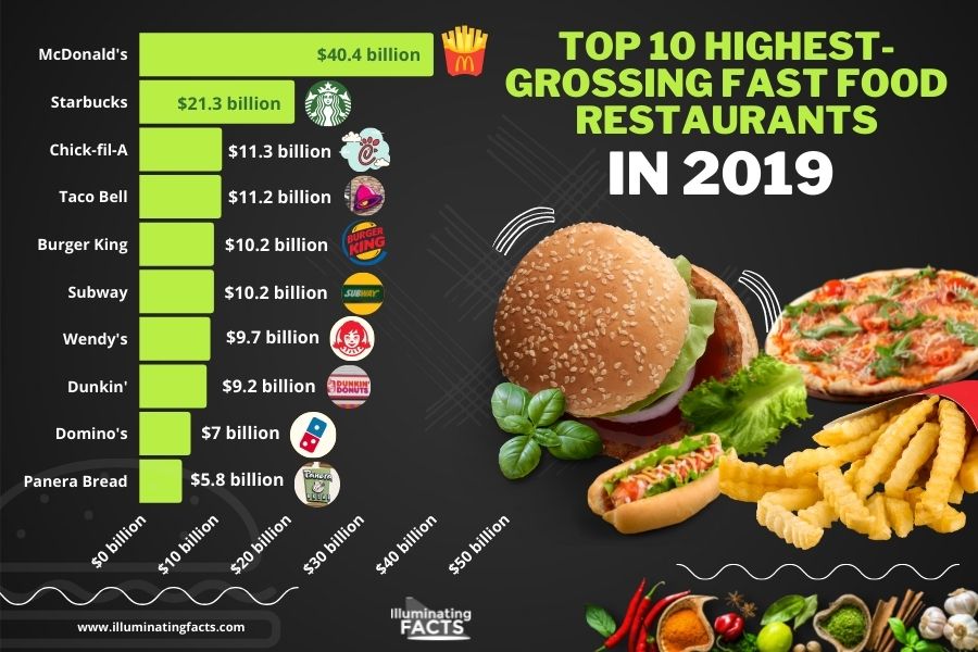
Fast food has certainly started to dominate the restaurant industry. Check out the top restaurants for 2019 in terms of revenues.