Recognizing Fast Foods Without Words
Logos appear on everything from automobiles to airlines to perfume to cups of instant noodles. Interestingly, many of these logos have remained in the public consciousness; and have become significantly more identifiable than some of the most well-known designer brands. Fast food restaurants' logos need a pleasant individuality that reminds customers, "I'm here, step in right now and enjoy your time." Fast food restaurants use their logo as a "welcome invitation" to guests and as an identifier of the establishment itself. The simple truth is that many of these food logos are regularly seen, making them highly memorable in the minds of the public. Food logos and fast-food restaurants have become universal in our culture. They may be seen on every corner of the grocery store and junction.
The Power of Logo
The significance of a company's logo cannot be overestimated because it is its most powerful single visual asset. Establishing a brand begins with choosing the correct symbol. Some say a fast-food company's logo is equally as significant as its distinctive cuisine. For example, McDonald's golden arches are one of the world's most identifiable symbols. ' McDonald's golden arches may be seen from the road in any city across the globe. Others' logos are instantly recognized, but none are as well-known as the iconic golden arches of McDonald's. And if you have visited the Philippines, you will never miss the smiling face of a sexy jolly bee of Jollibee, sitting just across the golden M of McDonald's.
Who can forget the Kentucky Fried Chicken (KFC) logo, the word "personality" couldn't be more appropriate to describe it? The logo has always featured an image of its founder, Colonel Sanders, whose eleven herbs and spices recipe has long been one of the world's most famous trade secrets. No doubt that KFC's logo and the Colonel's perceived uniqueness, always present in it, have played an essential role in making it instantly recognizable.
Furthermore, Pizza Hut's logo takes a more casual attitude than formal. It is almost childlike in its simplicity, but this is done on purpose, as evidenced by the brushstrokes, focusing on practically everyone, including families with small children and the public. Pizza Hut does not need an overly formal or sophisticated brand identity. Instead, they go for a more casual feel with a playful logo.
On the contrary, if you look at the Subway logo, you won't be surprised to notice that it's a little out there. Subway, founded to provide the beloved submarine sandwich, nailed its colors to the mast by adding the words "eat fresh" beneath the emblem. As the globe became increasingly health-conscious, Subway has grown dramatically over the last decade. There are only two arrows in the Subway design, making it unique among the other fast-food company logos.

Logos are intriguing – and necessary – concepts to understand and appreciate. Because a logo serves as a company's constant calling card, having a well-received one gives you a significant advantage over your competition. It's impossible to assess the monetary value of a well-known logo.
The Story Behind a Logo
It's always interesting to tell the origin story of something; doing so is a great way to break the ice; these stories of how these logos came to be is full of intrigue, charm, and a few well-kept secrets. These tales take on a new level of intrigue when set against a backdrop of stunning design hanging in your favorite restaurant. For anyone interested in the creative process, it is fascinating to learn how a company or designer came up with the concept of the most famous logo we see every day.
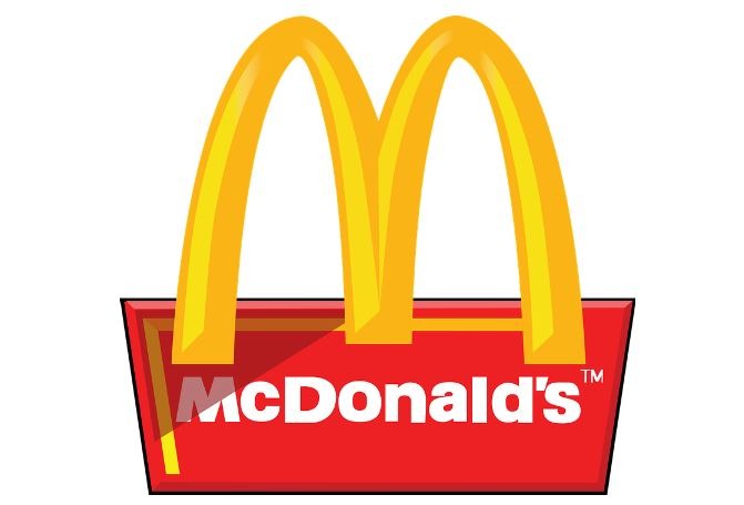
1. McDonald’s Golden Arches
No matter your opinion on their food, you cannot dispute the beauty and genius of the McDonald's logo. As far as forms go, it's perhaps one of the most well-known. It is an instantly recognizable logo because of the two arches that form the initial M, the vibrant yellow hue, and the overall simplicity of the design. However, the original concept was too different from this famous giant M; it used to have more words and a mascot named Speedee.
This world-famous chain started as a drive-in eatery by Patrick McDonald, which was later revamped by his two sons. Stanley Clark Meston redesigned the restaurant's architecture, following the McDonald's brothers' idea; he utilized the golden arches as the Speed-Service logo. These arches became McDonald's emblem and brand identification, debuting in 1955 without golden arches. McDonald's logo featured Speedee, the chef mascot. In 1961, Ray Kroc bought the company, removed Speedee from the emblem, and added the golden arches. This logo gained worldwide popularity; it was a simple, innovative method to portray the brand in multiple ways.
2. Instant Burger King
Keith Kramer and Matthew Burns opened a fast-food restaurant in Florida in 1953, greatly inspired by Mcdonald's. They came up with instant flame-broiled burgers, which were an instant hit. However, due to financial problems, James McLamore and David Edgerton bought the business and rebranded the restaurant like Burger King. Its first logo was a mascot king sitting on a Whopper and carrying a soda can that said burgers and shakes. The crown says 'Insta' even though the word isn't in the brand name anymore. The king remained on the logo for several years until 1969, when the burger bun image was adopted.
3. Dunkin’ Donuts
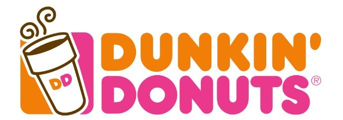
Dunkin Donuts has the most-changed logo. It was first launched in 1948 under the name of Open Kettle, which was rebranded as Dunkin' Donuts two years later. The first logo had a handwriting-like typeface and was brown to signify coffee. However, the font was plump, and, with its coffee-brown color, it reflects tasty donuts. Because of this observation, the logo was made more reflective and brighter. Dunkie, a donut mascot, who holds a coffee cup and donuts, was introduced as an official logo. In 1960, Dunkie was dropped for a more professional look; subtly, they used the coffee cup and donuts again. The brand name was rimmed in bright pink to resemble a dipped logo. The logo was then updated after several years. The corporation used this design for many years and then replaced it with a design wherein only donut-shaped lettering and cup remained. The coffee cup was put in 2002 but removed in 2019 when the restaurant relaunched. Dunkin' North America relaunched in 2019.
4. It Keeps Getting Better in Subway
Subway is the closest competitor of Mcdonald's in the US and has established more locations in the United States than there are McDonald's outlets. In addition, the history of how Subway started in the fast-food industry is an interesting one. When it first opened in 1965, it was known as Peter's Super Submarines and has become Americans' favorite. As it continued to improve, the company's name was changed to "Subway," with its original Subway symbol of an arrow shooting from S and Y. New colors and an oval backdrop were added to the logo over time as the company grew, and it remained in use until the early 2000s. Despite the corporation's rapid expansion, the symbol remained unchanged until 2016, when it underwent considerable revisions. Colors of green, yellow, and white are used in an italicized font as a design theme. The old format was replaced by a new, more appealing one; it removed letter margins to give a more uniform appearance. White was replaced with green and yellow. Now, the company is in the market for a new logo as it portrays a health-conscious sandwich shop.
5. Wholesome and Witty Wendy’s
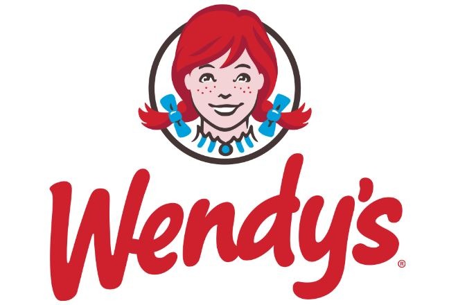
Wendy's logo has remained solid and consistent like Subway's. Since 1969, the logo, the daughter of the company's founder, has been nearly unchanged. The cute redhead smiling girl with pigtails is still there with a classic Western font. For decades, the insignia has conveyed warmth and friendship and a family-oriented ambiance of the restaurant. The company was started by Dave Thomas, a former KFC employee. While working at KFC, he learned the importance of brand personality, so he asked his daughter to pose and be his restaurant's logo, which he named after her. Undoubtedly, the public loved both the logo and the restaurants, which made it an instant hit, and he couldn't modify it. From 1971 to 1975, the logo had minimal changes; for instance, the phrase, "Quality is our recipe," was added, the pigtails were made horizontal, and the colors were darkened. Wendy's logo grew more vibrant by adding yellow, white, and a shield-like plate in 1982. For more than 30 years, this logo was the restaurant's main symbol with a few stand-alone versions. The original design was wholesome and nostalgic, but the company needed to modernize. 50 years after the logo was updated, no more shield, Western lettering, or brilliant colors. Her naturally curly pigtails were straightened and softened. In the lines of her collar, which spell "mom," if you're curious, she found a secret that made her smile wider. Modern and pleasant typefaces were utilized in a signature format for this new logo, keeping its unique look.